Driving Your Design System with Tokens
September 7, 2018
Working on a design system at a large company, I've noticed that depending on who you ask, they think the design system is something different. It's like the parable of the blind men and the elephant.

If you ask a designer, they'll say, "the design system is the UI kit!"
If you ask a developer, they'll say, "the design system is the component library!"
If you ask a third person, they'll say, "we have a design system?!"
All of those are valid answers. Ok, maybe if people aren't aware that you have a design system, you have some work to do.
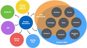
A design system has a number of parts built for different audiences: a UI kit with Sketch symbols for designers, a React component library and/or a CSS framework for developers, a documentation site for everyone, an icon library, etc. But how do we keep all of those things in sync? Especially when you have a rag tag group of full- and part-time team members of varying disciplines working on the system?
Design Decisions
In a large company, where many small teams are responsible for designing and developing individual features across platforms, our design decisions can become muddled pretty easily. We try to achieve consistency by creating tools for designers and developers, like the UI kit and CSS framework, but these are all separate implementations of those decisions.
What ends up happening is that the design tools and the dev tools inevitably fall out of sync and teams are left to implement features independently, and with varying degrees of success. With a focus on delivering new features, these implementations often don't get baked back into the tools for other teams to take advantage of.
To further complicate things, there are likely different frameworks for each platform to maintain or, in some cases, no framework at all. In which case developers might be making things like buttons from scratch every. single. time.

Design Tokens
Design Tokens are a tech-agnostic method of storing design decisions in key/value pairs that can be exported to a different formats based on platform (web, iOS, Android). They give us a shared vocabulary for describing visual properties that translate across platforms. Each platform might use different values to express color but when we say $color-green, we're all talking about the same thing.
So, variables basically?
Exactly. A lot of developers use variables to store values like their color palette or type scale. Design Tokens are like variables on steroids.
In his article Tokens in Design Systems, Nathan Curtis separates these variable types into two categories: options and decisions.
Options represent all of the distinct values available in the design system. Rather than letting designers and developers choose arbitrary values for things like type size and color, we can limit those options to a logical and manageable number so that we don't end up with 50 different gray values in production.
/* GROUPON */
$color-green = #53A318

/* LIVING SOCIAL */
$color-blue = #0088CC
$color-purple = #544AA1
$color-orange = #F0812BDecisions represent the contexts in which things like color, type, and spacing are utilized. At Groupon, which acquired Living Social, we not only have to support different platforms but also different brands across those platforms. So, while Groupon uses the same green color for brand elements like the header background, primary button and pricing text, Living Social uses different colors for all three. We can define these decisions in our design tokens.
/* GROUPON */
$color-brand = $color-green
$color-button-primary = $color-green
$color-price = $color-green

/* LIVING SOCIAL */
$color-brand = $color-purple
$color-button-primary = $color-blue
$color-price = $color-orangeNotice that the values here refer to other tokens, which would be defined within the options.
Subatomic Design
In his book, Atomic Design, Brad Frost introduced a methodology for breaking design patterns into a logical hierarchy. Atoms, the smallest unit, represent the fundamental building blocks of our design system. In a sense, design tokens are like subatomic particles.

A heading, for example, is made up of a number of property/value pairs: typeface, size, line height, font weight, color, margin, etc. We can apply token values to all of those properties.
.header-page-title {
  font-family: $font-family-heading;
  font-size: $font-size-heading-large;
  line-height: $line-height-heading-large;
  font-weight: $font-weight-heading-large;
  color: $color-heading;
  margin: $margin-heading-large;
}Notice that rather than using options like $color-black or $spacing-medium, we're applying decisions in a context specific to headings. This way, if we ever want to change the font weight of .header-page-title globally, for example, we can do so easily without having to search our entire codebase for every instance of a header and changing $font-weight-bold to $font-weight-light.
Tokens Across Platforms
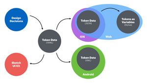
The real power of tokens comes when we use them to apply design decisions across platforms. By storing the token data in YAML, we can easily convert that data to the appropriate format to be consumed by web (preprocessor variables), iOS (JSON), and Android (XML). It might even be possible to power our design tools with tokens.

Storing our token data in YAML also allows for differences that might be necessary between platforms. Colors, for example, are typically defined in 6-digit hex on web, RGBA on iOS, and 8-digit hex on Android. We can define these separately and then omit the platform segment when the tokens are converted to each platform's format.
color :
  green :
    web : &color-green-web "#53A318"
    ios : &color-green-ios "0.33,0.64,0.09,1"
    and : &color-green-and "#FF53A318"
  blue :
    web : &color-blue-web "#0081E3"
    ios : &color-blue-ios "0,0.51,0.36,1"
    and : &color-blue-and "#FF0081E3"
  red :
    web : &color-red-web "#FC0048"
    ios : &color-red-ios "0.99,0,0.28,1"
and : &color-red-and "#FFFC0048"The Single Source of Truth
Designers and developers are always looking for the mythical "Single Source of Truth" in which all of their decisions are editable in one place and propagate everywhere. We make tools like our Sketch UI kit and CSS frameworks in hopes that they will serve as such but over time they tend to fall short.
Design Tokens are extremely powerful, not to mention resilient. What happens with our UI kit when Sketch is no longer the hot new design tool? Or when our React component library is made obsolete by the next JavaScript framework? (SPOILER ALERT: It will be.) Design Tokens allow us to adapt to new tools without having to re-implement everything from scratch.
When you ask the blind men what the design system is, perhaps they'll all answer "Design Tokens."
