Extreme Makeover Homepage Edition
April 6, 2021
A few weeks ago a friend of mine, who is a therapist, was lamenting about the fact that she's been paying $60 a month to host her website through one of those companies that offers template websites for professionals.
"That's outrageous," I said. "I could move it over to Netlify and you wouldn't have to pay anything."
Before I could consider the implications of this offer, she happily accepted. I had never even seen her website but I was confident it wouldn't be a big deal.
But when I took a look at her site and started to dig around, I decided I was going to just rebuild the entire thing from scratch and see if I could take her bloated, cookie cutter website and make it awesome.
Instead of redesigning the site I would attempt to try and recreate the design as close as possible by making a small design system. Here's how I did it.
Initial Audit
The first thing I did was run the site through the Lighthouse browser extension. If you're not familiar with it, Lighthouse is a great tool for measuring a site's performance, accessibility, best practices and SEO metrics. More importantly, it gives you actionable steps to improve those scores.
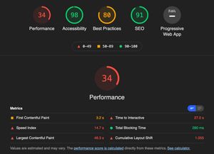
I've been using Lighthouse to improve the performance of my websites for the past couple of years and take great pride when I'm able to achieve perfect hundred scores across the board. This website was clearly going to be a challenge.
Digging a little deeper, there were a number of items contributing to these scores:
52 requests totaling 10MB. This included 390k of JS, 450k of fonts (5 families of different weights and an icon font for 2-3 icons), 164k of CSS and a bunch of unoptimized images.
An embedded map. These typically include a bunch of JS, CSS and images and rarely do people interact with them.
An accessibility overlay. As companies are scrambling to meet accessibility requirements, they often reach for one of these solutions instead of just making their website accessible themselves. The A11y Project recently published an article about why they don't recommend using them.
There were some other small things, but those were the biggest culprits. And none of this was added by my friend so much as she just picked out a template and added her content. I'm sure any other site offered by this company would be equally as unperformant.
Made with Eleventy
Eleventy has become my favorite way to get a website up and running quickly. One of my side projects, 11ty Recipes, is a site I turn to every time I'm setting up a new site from scratch and need to add certain Eleventy features.
This particular site was pretty basic. I added a Sass workflow and Eleventy's image optimization plugin and that's pretty much it. The site largely consists of a few static content pages, which is extremely easy to setup with Eleventy.
Cool CSS
I recently wrote about Cool CSS, my CSS methodology as well as a new framework I'm building that I can re-use from project to project, and this project was the genesis of that idea. By editing Cool CSS's design tokens, I was able to apply the color palette and type styles without having to re-write a bunch of CSS and replicate the design of the site in just a few hours.
Glyphhanger
I reduced the number of fonts down to just two and aggressively subsetted them using a tool called Glyphhanger. Sara Soueidan has a great article on using Glyphhanger to optimize your font files.
Hosted on Netlify
With Netlify, pushing updates to the live website is as easy as committing changes to your Github repo. Netlify makes it easy to roll back changes and offers a ton of other great features. It's revolutionized how I build and host sites. It pairs great with Eleventy, building your site before deploying it.
Another cool feature is Netlify Forms. You can add a netlify attribute to any form element and when the site is built, Netlify will automatically handle form submissions. You can then set up any number of form handlers to forward submissions to an email address or automatically execute more complex tasks as needed. I used this feature for the contact form, with the submissions forwarding to her email.
Full disclosure: I am literally wearing Netlify pajamas right now.
Finishing touches
With the site built and styled, there were just a few more things to really get those Lighthouse scores up:
-
I inlined the CSS in the
<head>to reduce the number of requests. I was able to reduce the amount of CSS from 164k to 8k. -
I preloaded the fonts.
-
I replaced the embedded map with a static map and positioned the address on top of the image.
-
I adjusted the color palette to provide accessible contrast ratios.
-
I added a favicon and improved the site's meta info.
-
I removed all JS except a little menu toggle function for small screens.
Move. That. Bus.
Are you ready for this?
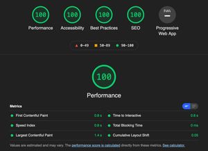
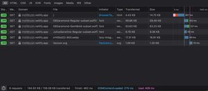
In total, I reduced the number of requests from 52 to 6 and the total size from ~10MB to 165k, and a large chunk of that are the two weights of EB Garamond. The page's time to interactive went from 27 seconds to 0.8 seconds. Not bad!
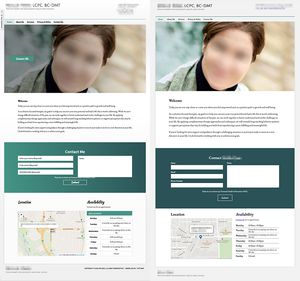
And here's a side-by-side comparison of the original site (left) and the new site (right). Aside from a few accessibility improvements and spacing adjustments, it looks largely the same. (I obfuscated her personal details, per her request.)
Final Thoughts
Overall, I'm really happy with how this makeover turned out. I was able to take an extremely unperformant site and rebuilt it from scratch in a very short period of time. It served as a great example of how Cool CSS can be used to build just about any site without having to write a ton of CSS.
The techniques I've outlined here aren't rocket science. Thanks to great auditing tools like Lighthouse, and great development tools like Eleventy and Netlify, you can make substantial improvements to the performance and accessibility of just about any website.
Hit me up on Twitter if you have any questions!
