Design System Diary (Part 1)
February 17, 2023
I started my new role as Principal Design Systems Engineer at Turquoise Health just over a month ago and thought it might be useful/interesting to document my process of building a design system from scratch.
Design System Deck
One of the first things I like to do when starting a new design system is make a Keynote deck about design systems and my approach to building them, as well as my plan for how we'll build this specific design system. Every company is different — products, needs, personnel, tech stack, etc. — but a lot of the foundations of building a design system are similar.
I try to make this deck accessible to folks of different disciplines, so that people can get a basic understanding of design systems and the value they create regardless of whether they are actually working to design/build the product. The deck also serves as a great onboarding tool when new people join the company.
The basic structure of the deck is:
- Why companies struggle with getting a design from concept to production
- What are design systems and how to they help solve this struggle
- What is the plan for building our design system
- How will we support and iterate on the design system once it's built
I've written previously about 1 & 2 so I'll mostly write about the process of building and supporting the system in this series.
Design System 1:1s
Identifying key stakeholders starts in the interview process, before you even get hired. Figure out who is driving product decisions and who are the folks responsible for designing/developing the product. Some people's eyes might light up at the mere mention of design systems. These are your people. They will help build and advocate for the design system.
One you start the job, one-on-ones are a great way to get a better sense of what the existing process of building the product is like and getting honest feedback about what's working and what's not working.
They're also helpful in understanding and aligning people's expectations. What will the system do? How long will it take to get there? How will we measure success? What does failure look like?
Brad Frost has a great set of design system interview questions that I use as a reference.
Visual Design Audit
This is where I dig into the product and the designs to identify all the different visual styles in use (type, spacing, color, icons, etc.) and try to narrow them down into a discrete set of values. What are all the values we're using and in what contexts are we using them? Can we consolidate similar colors/sizes? Do the color combinations we're using have sufficient contrast?
Design Tokens
Once we've established our visual style values, we can store them in design tokens. The design tokens can be consumed by different design and development tools to help keep the values our designers and developers are using in sync, regardless of the technology they're using to implement them. (Figma, CSS, JSON, etc.)
I wrote more about tokens in this post about a hackathon called Simple Groupon.
UI Kit
I often say that if your design system is primarily engineering-driven (a component library/CSS framework) and the designers aren't designing with the system, then you don't have a design system. It's crucial that the designers have an equivalent library of components in their tools (Figma/Sketch) that allows them to create new designs that align with the tools developers are building the product with. Otherwise your component library is going to be constantly growing as designers add new features that deviate from existing styles.
A big part of my job is meeting regularly (at least once a week) with designers to get a sense of what they're working on and determining if anything needs to be added/updated in the system.
I was extremely pleased to discover that Turquoise's designer (shoutout Rob!) had already developed a comprehensive UI Kit in Figma that was extremely well thought out and organized. It's going to make building out the supporting CSS framework much easier than if we needed to start a kit from scratch.
What's next on the roadmap?
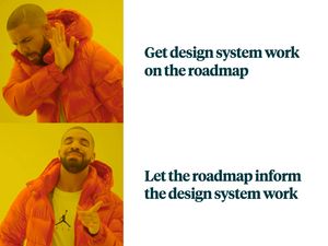
It can be incredibly daunting to come into a company as the only design systems person and figure out where to start building a design system. You might be inclined to make a laundry list of things you want the system to include, only to struggle to get its implementation on the product roadmap.
Dan Donald recently asked on Twitter:
What would you consider an MVP to be for a design system 🤔
— Dan | Design Advocate @zeroheight (@hereinthehive) February 16, 2023
My response: "Whatever you need to support the next feature on the roadmap."

By letting the roadmap inform your design system, it will help you focus on just the things you need in the system right now. All of the visual styles, icons, components, etc. that you need to support the next feature become a tiny design system. When building the next feature, you'll already have a solid foundation and each successive feature you support will require less and less work to add to the system, allowing your team to ship things faster and faster.
I've found that it's much easier to get support for this approach than trying to convince people to add design system work to the roadmap.
From prototype to design system
Once I've identified the next feature on the roadmap, it's time to start building! I like to do this work in CodePen. I have a template that I use that's blank except for pulling in the design system's CSS framework. (Of course, for this first feature, we don't have a framework yet!)
I write all of the markup and styles that I need to accurately reproduce the design. This includes tokens (as CSS custom properties) and icons (as an SVG sprite).
It's incredibly useful to build out the entire page layout of the feature so that the prototype looks like a complete page that the user will interact with. It also has the benefit of being reused across other pages/features. It may be useful during the visual style audit to note all of the different layouts in use and try to narrow them down into a few different types.

This is even more crucial as the company grows and the product team splits off into smaller teams dedicated to a single part of the product. Often there isn't a team responsible for shared parts of the site that all the teams use like layouts and icons.
Once the prototype is built, I share it with designers, engineers and product managers to get feedback and make adjustments as needed. They can view the prototype on different devices, see the code and make changes while seeing the prototype update live.
When everyone has signed off on it, whatever additional styles I added that didn't already exist in our CSS framework get added to the framework. When I release a new version the template, using the latest CSS, I can safely remove all of the CSS from CodePen and the prototype should still look the same.
From here, the engineering team can take the prototype and build out the functionality of the feature without having to worry about what it looks like. Instead of delivering a picture of a website, we're delivering production-ready markup and styles.
Supporting the design system
Even before getting started on building the system, it's important to let everyone know that you are there to support them and establishing a number of methods for people to get support. In Design System Advice I wrote about adopting a service mentality:
Working on design systems, your customers are not your company's customers. Your customers are designers, engineers and product managers. Your job is to help make their jobs easier.
Look for opportunities to connect with these customers.
Establish regular office hours where people can drop in and ask questions, pair on solutions or just hang out and get to know you.
Make a dedicated Slack channel where people can ask questions and get support. Even if you're a solo design system team, having people ask in a channel rather than a DM allows other people who might know the answer to help out and is easier to reference than private conversations.
Make yourself available for questions and 1:1 sessions.
Get feedback via surveys and/or quarterly retrospectives. Soliciting feedback can be challenging, but it's important to give people that opportunity, even if they don't take advantage of it.
Evangelize the system through brown bags, lunch and learns, company all-hands — any opportunity to address large groups in the company who might not be familiar with you or the work you do.
Let people know that you're there to make their jobs easier. They love that!
What's next?
Once our first prototype is done, I'll be working on building out the CSS framework and documentation site, which I'll cover in the next part.
Do you have questions? Anything you'd like to see me write more about? Let me know!
