Simple Groupon
July 6, 2020
A few weeks ago we had a one-day hackathon at Groupon called Simple Groupon. The basic theme was to work on projects that simplified our processes and tools internally or simplified our customers' experience. I decided it would be a great opportunity to demonstrate the power of our new Groupon Design System to the broader engineering organization.
With our current process, implementing visual style changes can be time-consuming due to existing technical debt and varying degrees of people's comfort/ability with CSS. Supporting multiple brands (including Living Social) and A/B testing new designs adds further complexity.
Our current styles are largely built with our in-house CSS framework serving as a foundation, similar to Twitter Bootstrap, with individual product teams adding their own "app-specific styles" in order to match the specs provided by design. This leads to a lot of redundant styles scoped to very specific components. Our homepage CSS, which is a combination of our framework and app-specific styles, weighs in at 238k. It includes a number of one-off colors, text sizes and z-indices, and suffers from a lot of specificity problems, as developers fight with the cascade in order to override previous code.
Our new design system addresses these challenges in a couple of ways. First, through the use of design tokens, we can manage all of our visual style decisions in a single file and make updates to it without needing to touch any HTML or CSS.
I've written about design tokens previously, but my thinking on tokens has evolved a bit since then. By using three layers of specificity, we can apply varying degrees of control over our visual styles.
Global Tokens include all of the possible values in the system. The color palette, type scale, spacing values, etc. If we want to change the value of Groupon Green, we can do that here and it will change everywhere that token is used. What once took us several weeks can now be done in a few seconds.
$color-blue-600: #0070CC;Contextual Tokens describe how Global Tokens are used. They include common values that are used across multiple components, such as $color-background-brand. Contextual Tokens allow us to change from one Global Token value to another across multiple components.
$color-background-interactive: $color-blue-600;Component Tokens are values specific to a single component and can point to Contextual Tokens, Global Tokens, or even one-off values. Component Tokens allow us to make changes to a single component — changing the background color of the CTA button from green to blue, for example — without having to edit the app styles.
$button-cta-background: $color-background-interactive;As it turns out, Brad Frost wrote about this over two years ago, and it must have stuck in my brain. I'm like Pete Campbell inventing direct marketing over here.
The other change I made was to separate the visual styles of components from their layout. Since we can't be sure of all the different contexts in which a component might be used, it makes sense to exclude external values like margin, and instead apply these using utility classes, like in Atomic CSS or Tachyons, where each class does one specific thing.
This allows us to compose new components without having to scope all of the styles required to arrange its parts to a class that is specific to the context. Take a deal card for example. Compare this markup from our current site, stripped of data attributes, with this markup from the Refresh example below, which produces a similar result with less markup and no references to the content or context of the component.
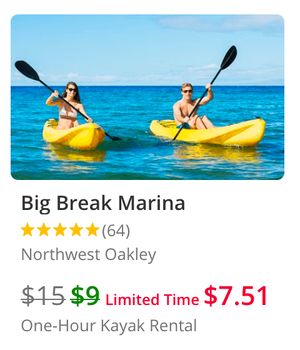

This new approach greatly reduces the amount of HTML and CSS required to reproduce a design, eliminating almost entirely the need for "app-specific styles", making pages much more flexible and maintainable.
GDS Framework
The Groupon Design System includes a new CSS framework built entirely from scratch. It builds on everything I learned from developing CSS frameworks for our internal tools, consumer- and merchant-facing products. The framework is built using Eleventy, an incredibly simple and easy-to-use static site generator. It uses SASS for CSS pre-processing, but could just as easily use Stylus or CSS variables.
gds-grpn.css is compiled from a bunch of individual .scss files. The Groupon design tokens are imported first, so that all the other files have access to them. For additional themes, the Groupon tokens serve as the defaults, to which a separate tokens file can build upon by adding or modifying token values before they are used by the style files.
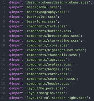
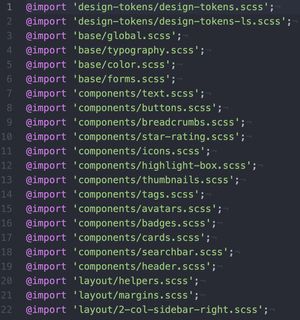
The different Deal Page examples are built using a templating engine, so you can include the name of the theme in the front matter and then call it in various places in your HTML like this:
<link href="/css/gds-{{theme}}.css" rel="stylesheet">Examples
Here are four versions of the deal page I was able to produce using the new Groupon Design System. The last three designs were all done in half a day. The same result would take dozens of engineers weeks to implement under our current process.
Note: None of these are responsive, unfortunately, since our current site is also not responsive and I only had a day to work on this. I'm not a miracle worker, Ethan!
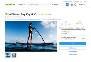
Refresh
I applied our latest design system styles to this replica of our existing deal page in the week leading up to Simple Groupon in order to build out the framework and figure out all the different components I'd need to compose the page.
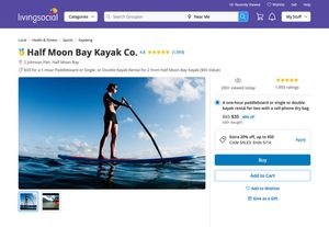
Living Social
Using the same markup and styles, I updated a few token values to support Living Social.
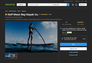
Dark Mode
I did a quick exploration of a Dark Mode version of the deal page.
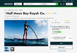
Rebrand
We can make even bigger changes to achieve a dramatically different design in a very short period of time. This page took me just an hour to make. I changed the font to the variable font, Jost, bumped up the font scale and the border width, squared the borders, and added three new colors.
Compared to our current homepage CSS (238k), the CSS for the above examples weighs in at around just 20k, uses less markup, and is far more maintainable.
Special Thanks
None of this would have been possible without the help of my Design System Team colleagues, Michelle Witkowski and Lila Fagen, who have helped drive the visual direction of the system and built the tooling designers will use to deliver designs using the new system. Also, thank you to the entire Groupon Design Union, who helped put the system through its paces and helped contribute to it in ways big and small. And to my manager, Matt Hanson, for supporting and advocating for the design system for many years. Also thanks to all of the developers who provided feedback and contributed to Toolstrap, GIG and Mixer over the years and challenged my thinking about design systems and CSS frameworks. Finally, thanks to the design system community for being so generous with their time and knowledge, and constantly pushing design systems forward. This was truly a team effort!
